A case study on a challenger brand looking to make waves in the financial world.
This case study is part of my UI Design course. The use case involved the creation of a UI for a new responsive banking application. The “client” is a challenger brand looking to make waves in the financial world by means of an intuitive app that help them stand out from the crowd.
The Problem
Our “client” is a new financial company that wants to gain a competitive advantage by using responsive and intuitive design.
My Role
I acted as the user interface designer on this case study.
I worked alone for the most part, but collaborated with others for testing and feedback sessions.
Objective
Creation of a polished user interface for three key screens for a new responsive banking application that works on mobile, tablet and desktop, while taking into account their tone and personality:
Playful
Clear
Trustworthy
Research
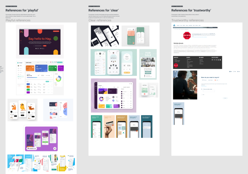
Moodboard
A key consideration of this project is the tone, personality and values of the brand. Therefore, I created a mood board of design references to serve as a valuable source of inspiration which could be easily shared with the client.
Before gathering my references, I compared different competitors in the banking industry to find inspiration, conventions and potential problems to avoid. Besides the banking industry, I also looked for other products that communicated the qualities of the client’s brand:
Playful: through color, animation or shape.
Clear: through typography, white spaces, and a great user experience
Trustworthy: through the sense of safety and trustworthiness
Define
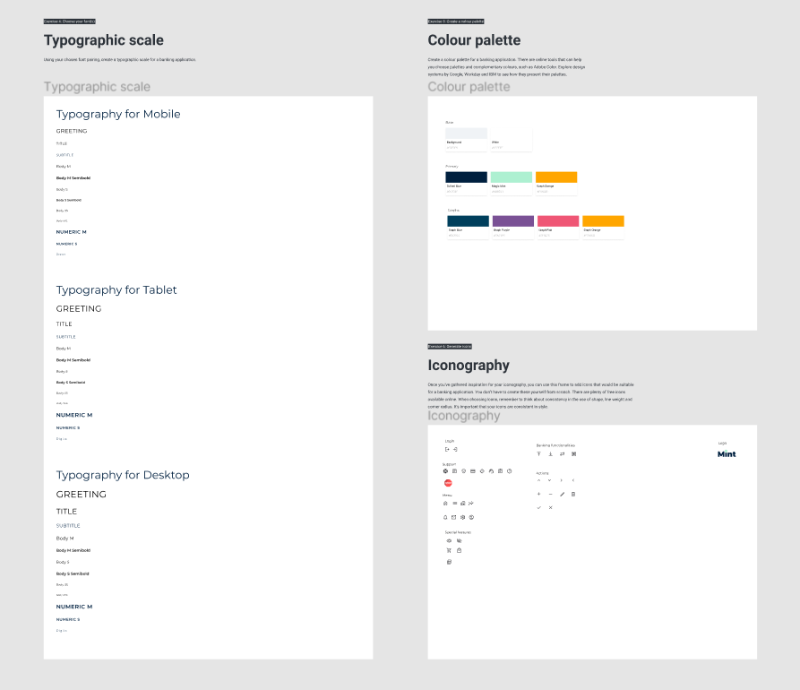
Design system & elements
Based on the research and the mood board, I gave my banking app a name and started defining the UI elements for the banking application. The decisions I made were mainly build on best practices and conventions, but were also tweaked to make sure the qualities of the brand stood out in all of these decisions.
The design system included:
A grid system for all screens required: mobile, tablet, and desktop
A clear font and typographic scale for clear communication
A color palette to convey the brand’s personality while avoiding any contrast issues
A set of icons in line with the brand which could be used to amplify the user experience
Design
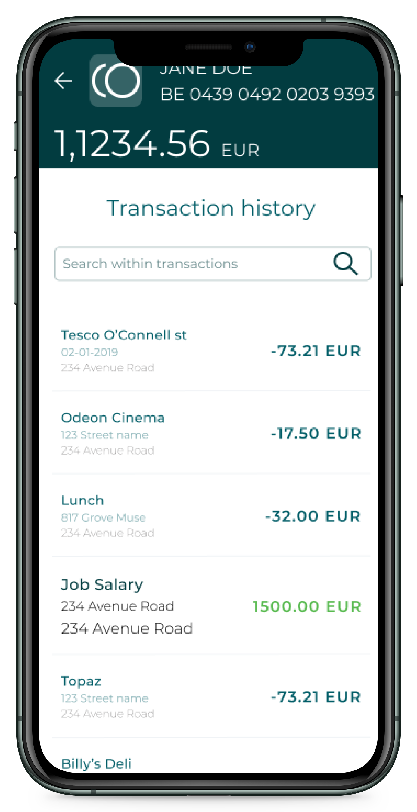
Design Iterations
We received the basic structure and functionality of the app in a low fidelity format, without getting into too much detail. I used this as the basis for my design and kept improving where possible. This way the low fidelity wireframes transformed into a high detailed design over time. If I was in doubt about certain design decisions, I asked volunteers to test or to give feedback.
The iterative process undoubtedly influenced my design system. Components were constantly being added, updated, removed and re-used.
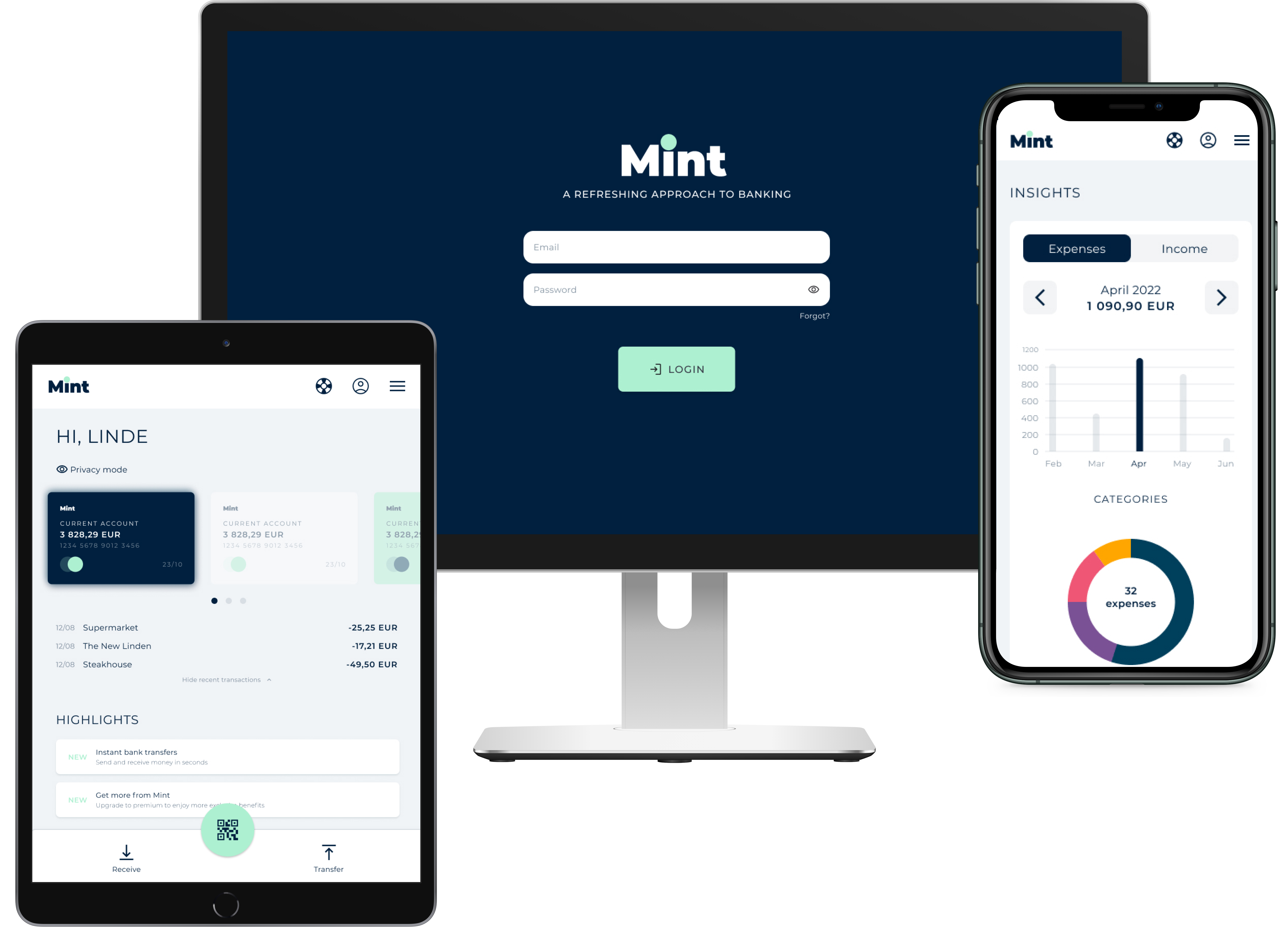
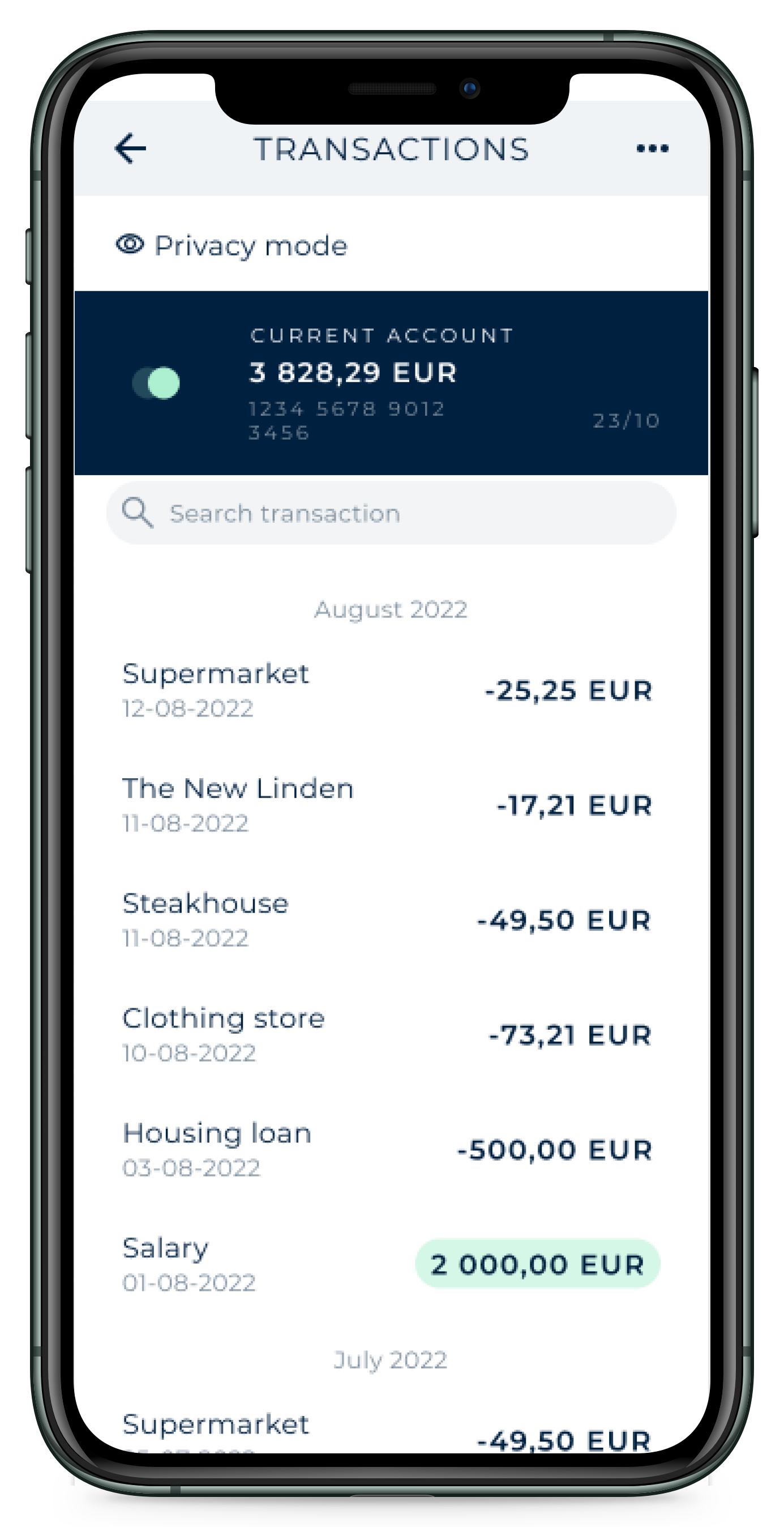
Final design
After the iterations and profound testing, I successfully delivered the final user interface as a clickable prototype in Figma.
This project was time-consuming, but also very fun. Creating the banking application has taught me that practice makes perfect; and that the devil is in the details. One of the most important takeaways that I’ll bare with me is that it is okay to change your mind. Although I met the objectives of the course successfully, I can’t ignore the little voice inside of me saying that the design system and prototype can still be improved. However, this was a great first project as an aspiring UI Designer.