A case study on a new airline trying to break into the market.
This case study is part of my UX Design Institute course and involved multiple projects related to a single case study: researching, designing, and prototyping a website or mobile app for a fictitious new airline company called Fly UX.
The Problem
Flight booking applications tend to be challenging for users to navigate and can cause frustration.
Our “client” is a new airline company that wants to gain a competitive advantage by using great design.
My Role
I acted as the user experience researcher and designer on this case study.
I worked alone for the most part, but collaborated with others for brainstorming sessions.
Objective
Use great design to create an advantage over airlines that are stifled by a more bureaucratic approach to booking flights.
Research
Competitive Benchmarking
I compared different competitors in the flight booking industry or related industries, to find any conventions and common problems to avoid.
Findings
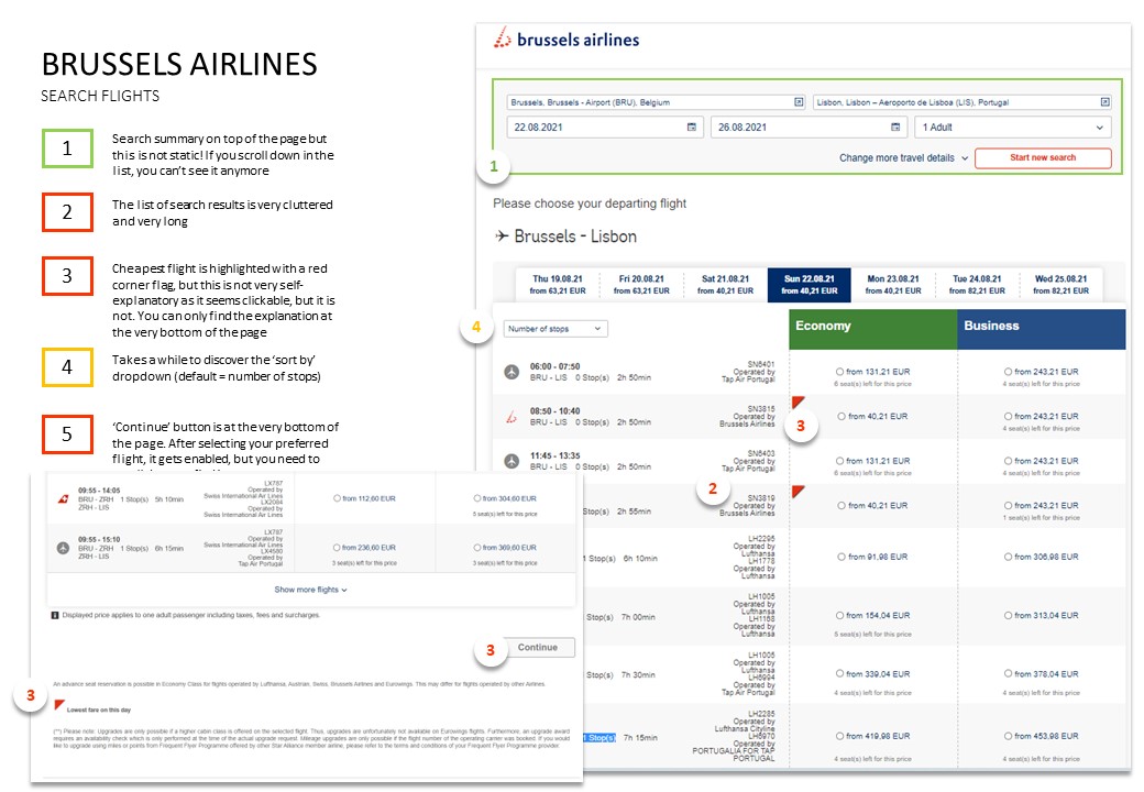
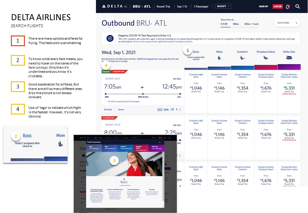
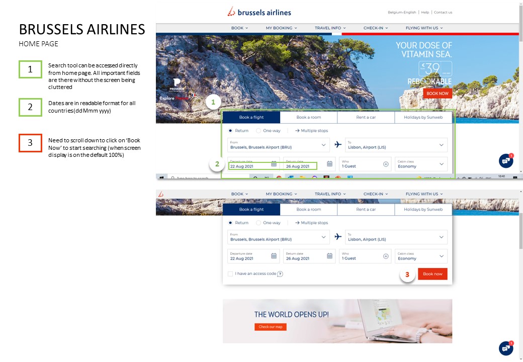
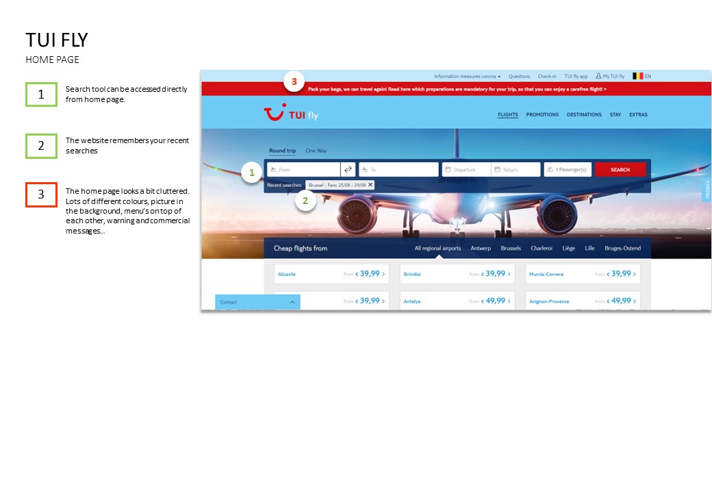
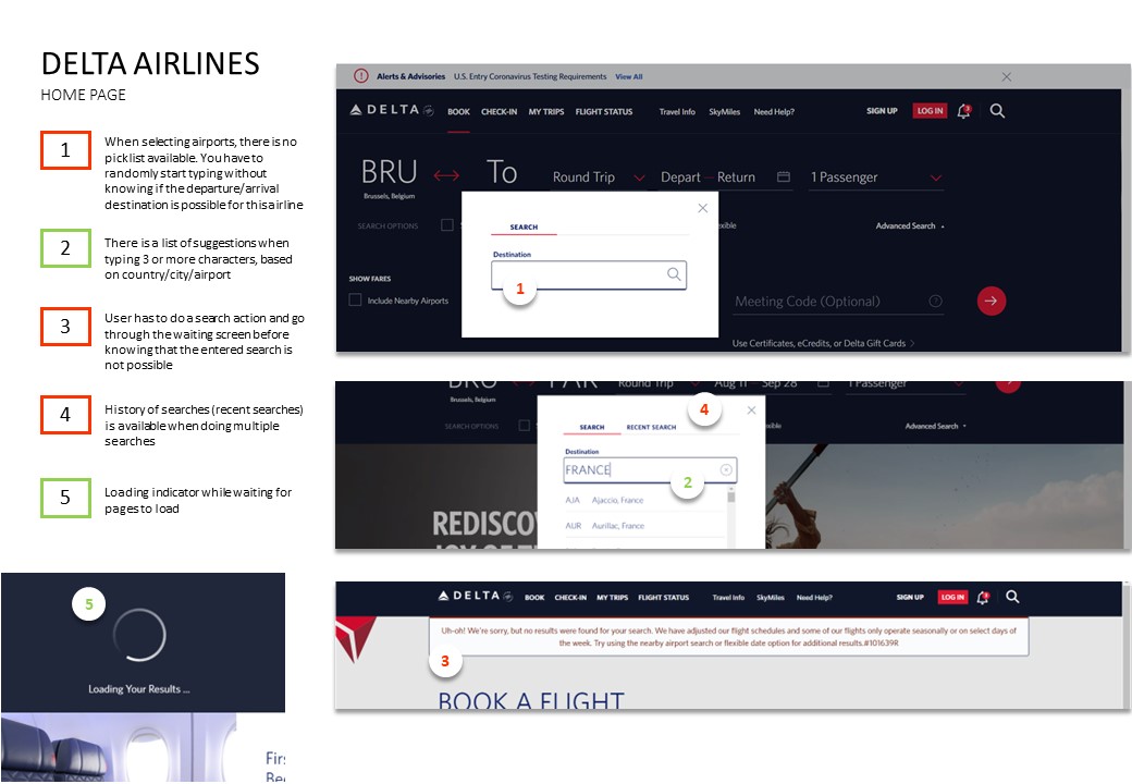
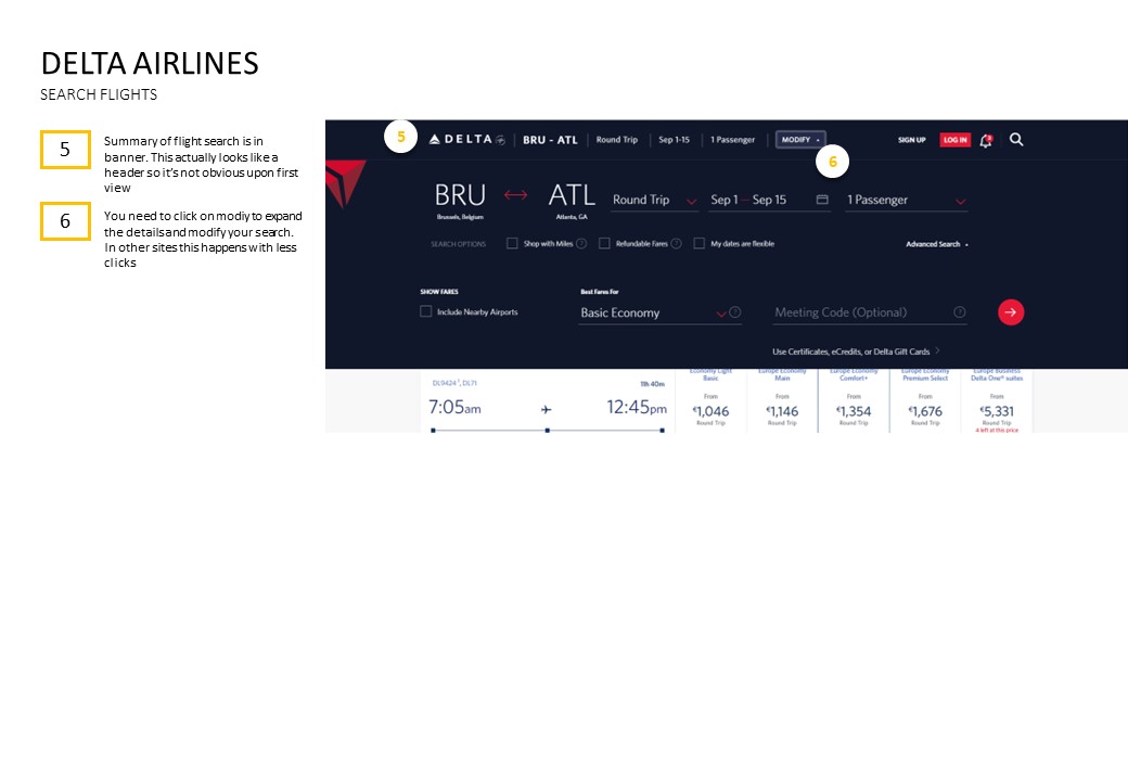
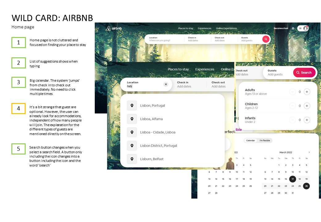
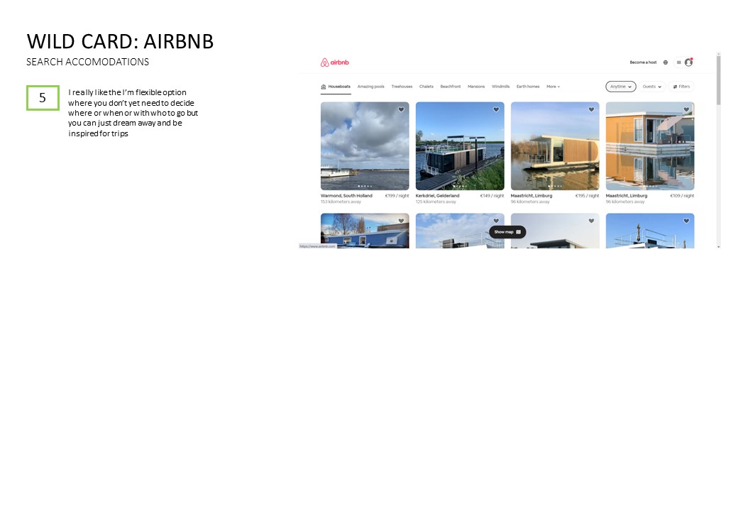
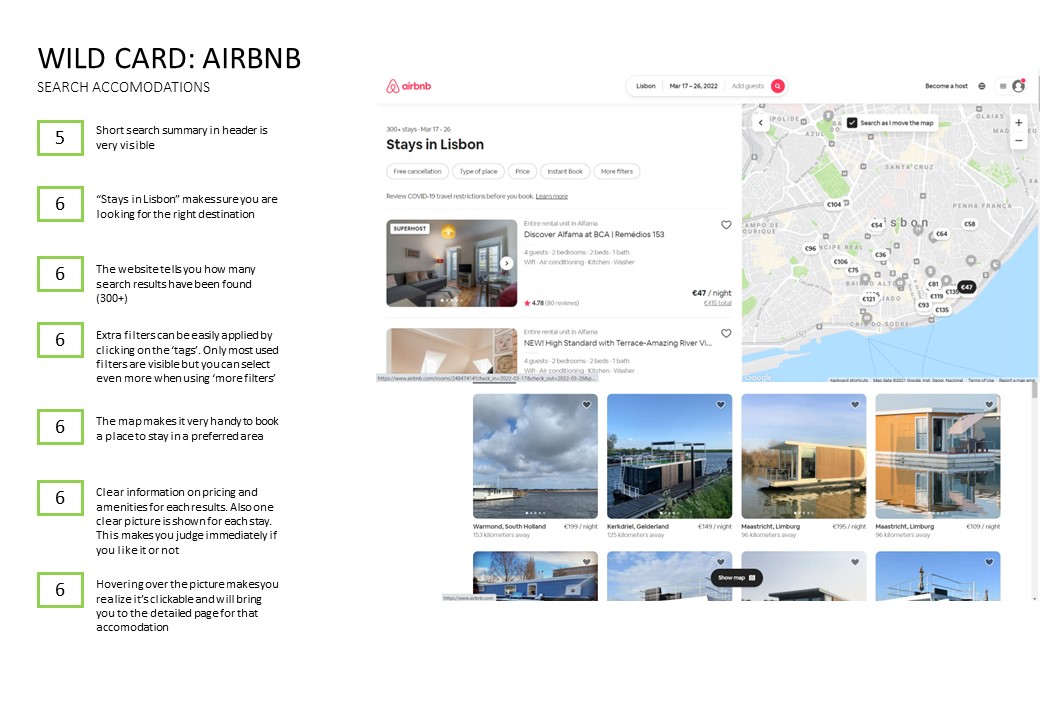
The search tool is almost always accessible directly from the home page. Usually, this was was a simple form that could be expanded for more complicated searches. Search results were almost always shown on another page from where the search could still be adjusted. On one hand, I discovered very useful elements, like the suggestions that appeared below the departure and arrival airport, or the date pickers and the ability to fill in departure and return date by one click only. On the other hand, I got very frustrated when I couldn’t find how to modify my search or when the screen was too cluttered with a lot of information and adds I didn’t care about.
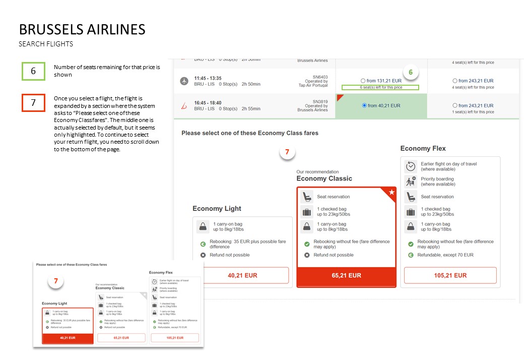
When selecting flights, the most important differentiators were often clearly indicated: price, duration, departure and arrival times, number of stops, etc. A very useful element I noticed was the ability to compare the prices between nearby dates.
Related to the selection of travel fares, I got confused quite often. The most common option was in most cases visually indicated or tiled but it was sometimes very hard to understand what the different fares meant.
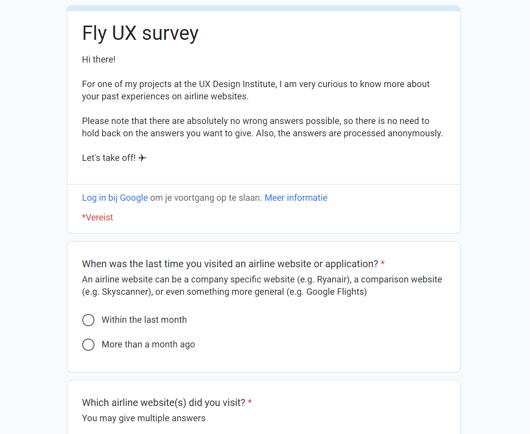
Survey
I created an online survey to learn more about the goals of airline customers and their past booking experiences.
Findings
Sending out a survey was a quick and easy way to discover insights from different type of passengers. It helped me broaden my horizon with other perspectives and opinions. After analyzing the data, I had quantitative and qualitative data about:
What are users trying to do
What is preventing them from doing it
What other features would they like to see
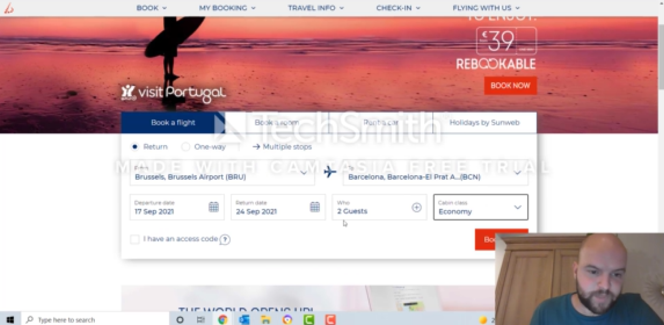
Usability Tests
I prepared an interview brief and conducted two usability tests with our competitor’s flight booking software to learn the kinds of features users expected, the pain points they run into during the process, and what conventions they followed.
Findings
As this were my first usability tests ever, I can tell you that these were a real eye opener. It was very interesting to observe users with an entire different profile in action and identify pain points, confusion, and areas for improvement. Although we were in the middle of the covid pandemic and people were not really keen on booking flights, the usability tests helped me a lot to validate my designs.
Define
Affinity Diagram
After doing research, I ran an affinity workshop with a volunteer.
Our goal was to organize the (unstructured) data gathered from the research stage into clear insights that could be used to improve the product and avoid possible pitfalls.
We came up with an extensive list of observations. These went into detail about the user’s goals and problems during each stage of the booking process. We then classified all the observations into groups based on their similarities, and gave each group a suitable name. Now, I didn’t only have a better understanding of the user’s needs and concerns, but I also ended up having a structured overview of the most important data that could serve as a starting point for the next steps in the design process.
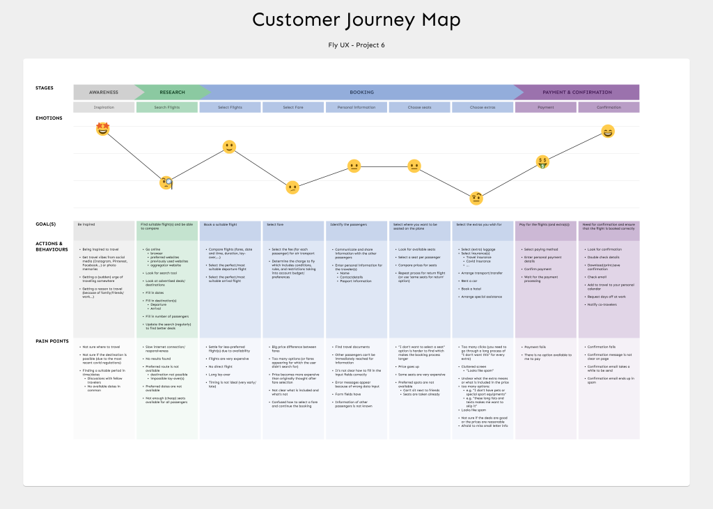
To transform the data in a highly structured document, I designed a customer journey map.
This included all of the different goals, actions, behaviors, pain points and emotions that a user would experience while booking a flight; using data gathered from the previous stages.
During the design phase, I could refer back to this user’s journey to see if I could solve some of the pain points.
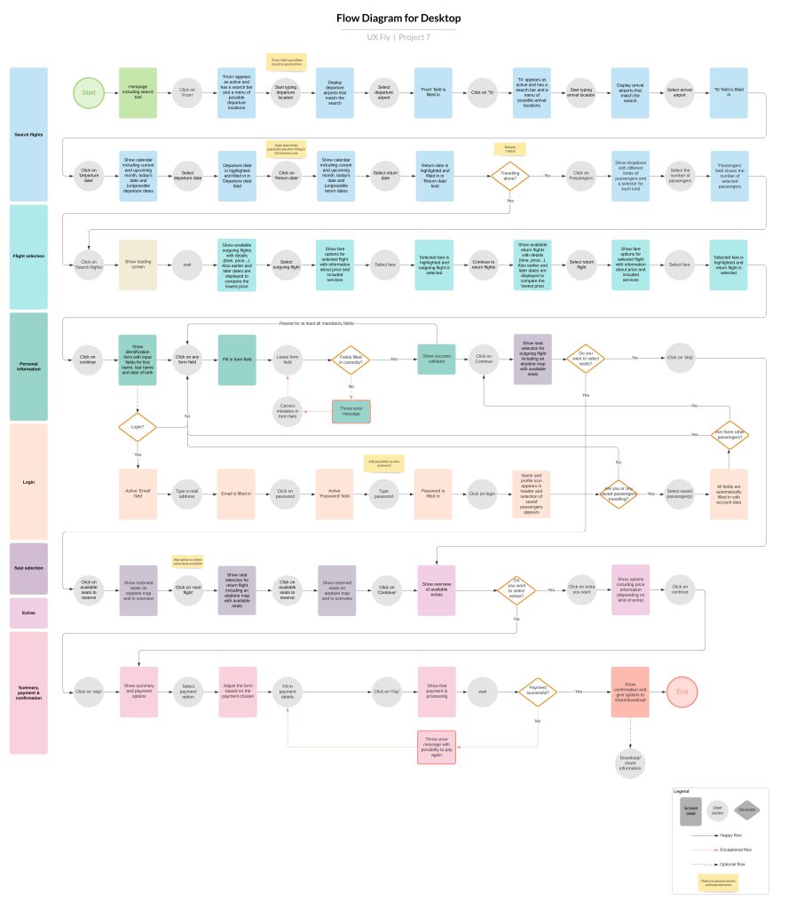
Before I started sketching or designing, I put together a user flow diagram to get a better idea of the high-level flow for booking flights on my new airline website. While creating the flow, I tried to address as many uncovered issues during the research phase.
I found this very useful to get a better understanding of the screens that the user will soon walk through, and the actions that lead up to booking a flight. Also, this gave me a very structured representation that I used as the groundwork for my designs.
Based on the flow diagram, I transitioned into solution mode.
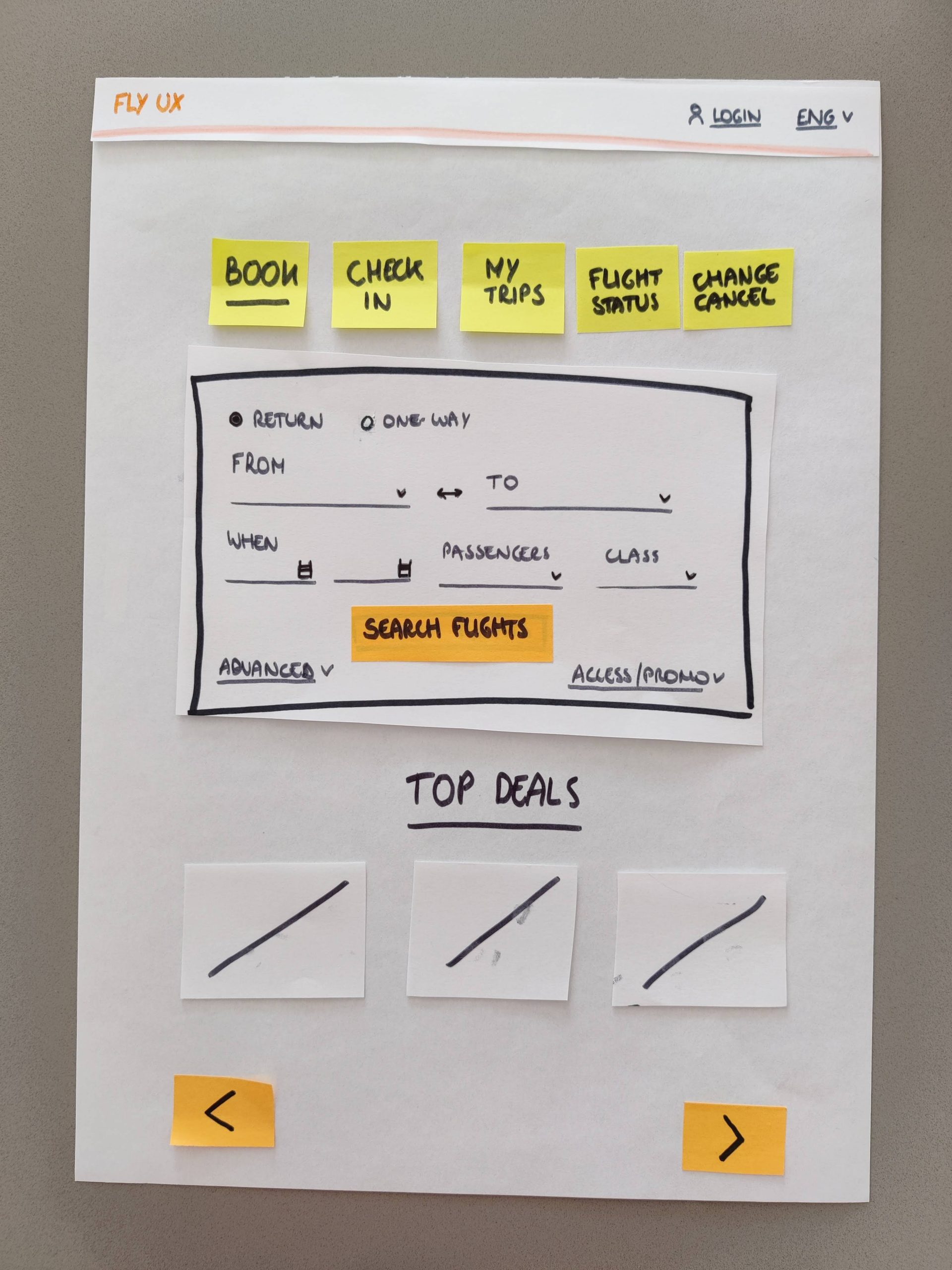
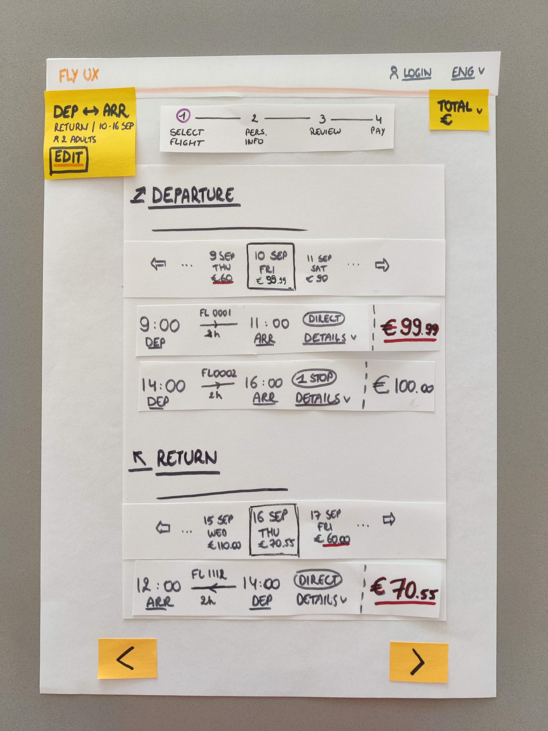
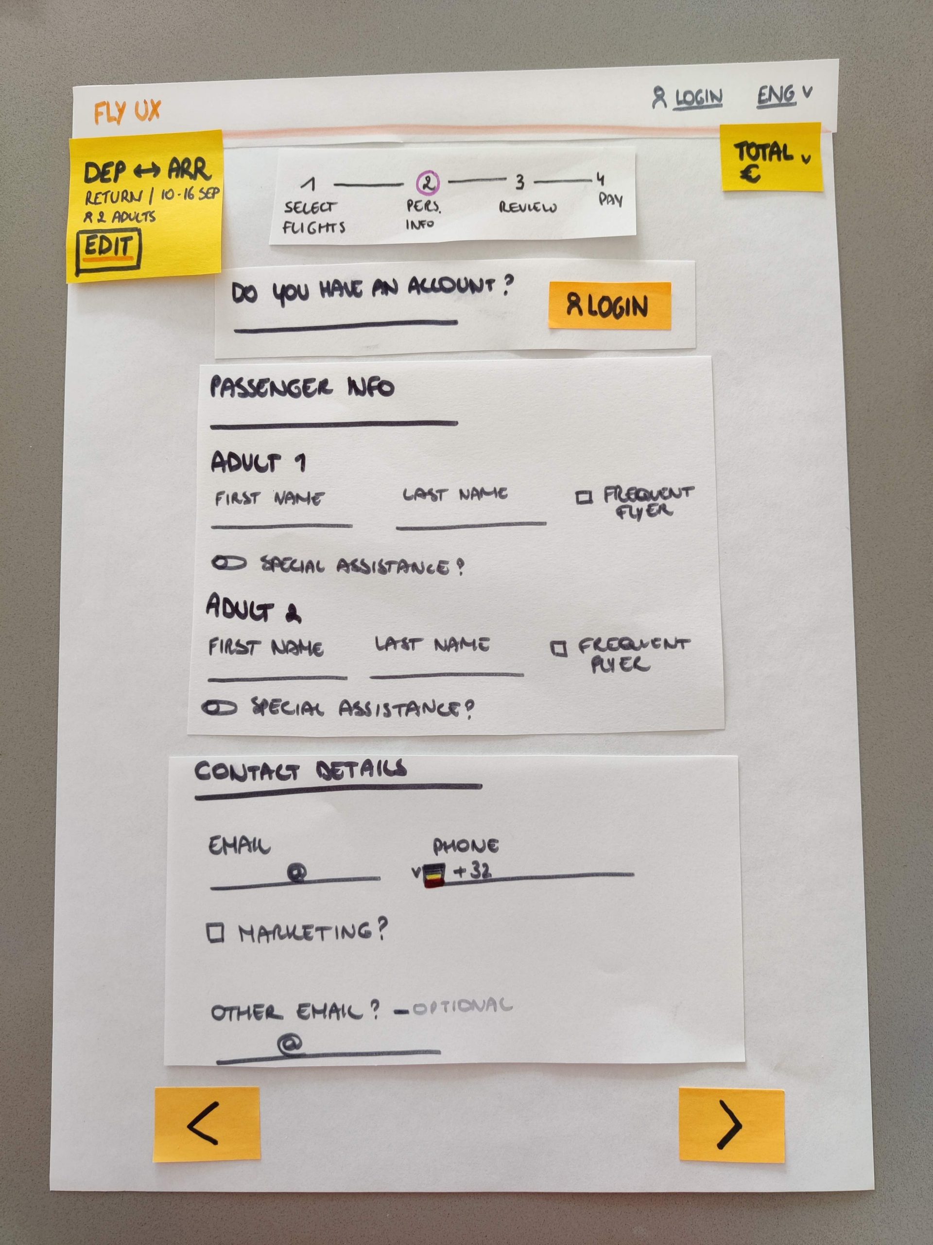
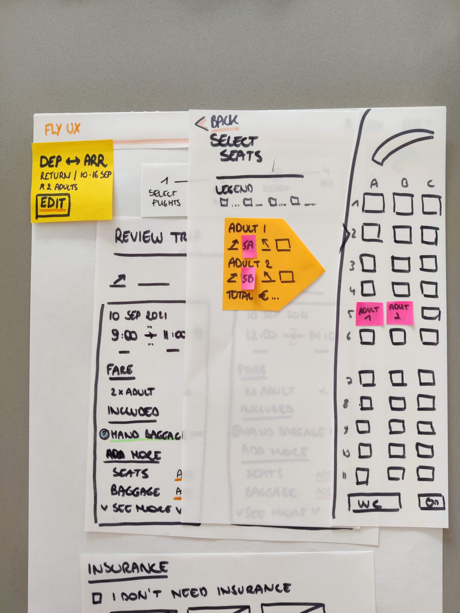
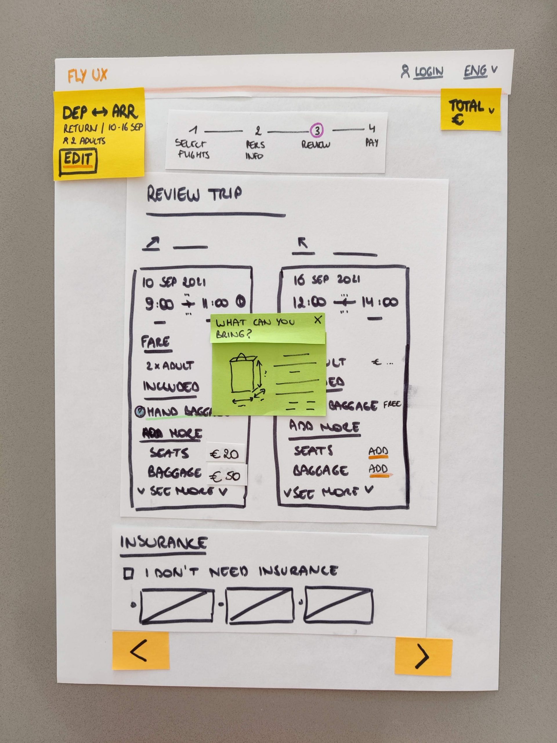
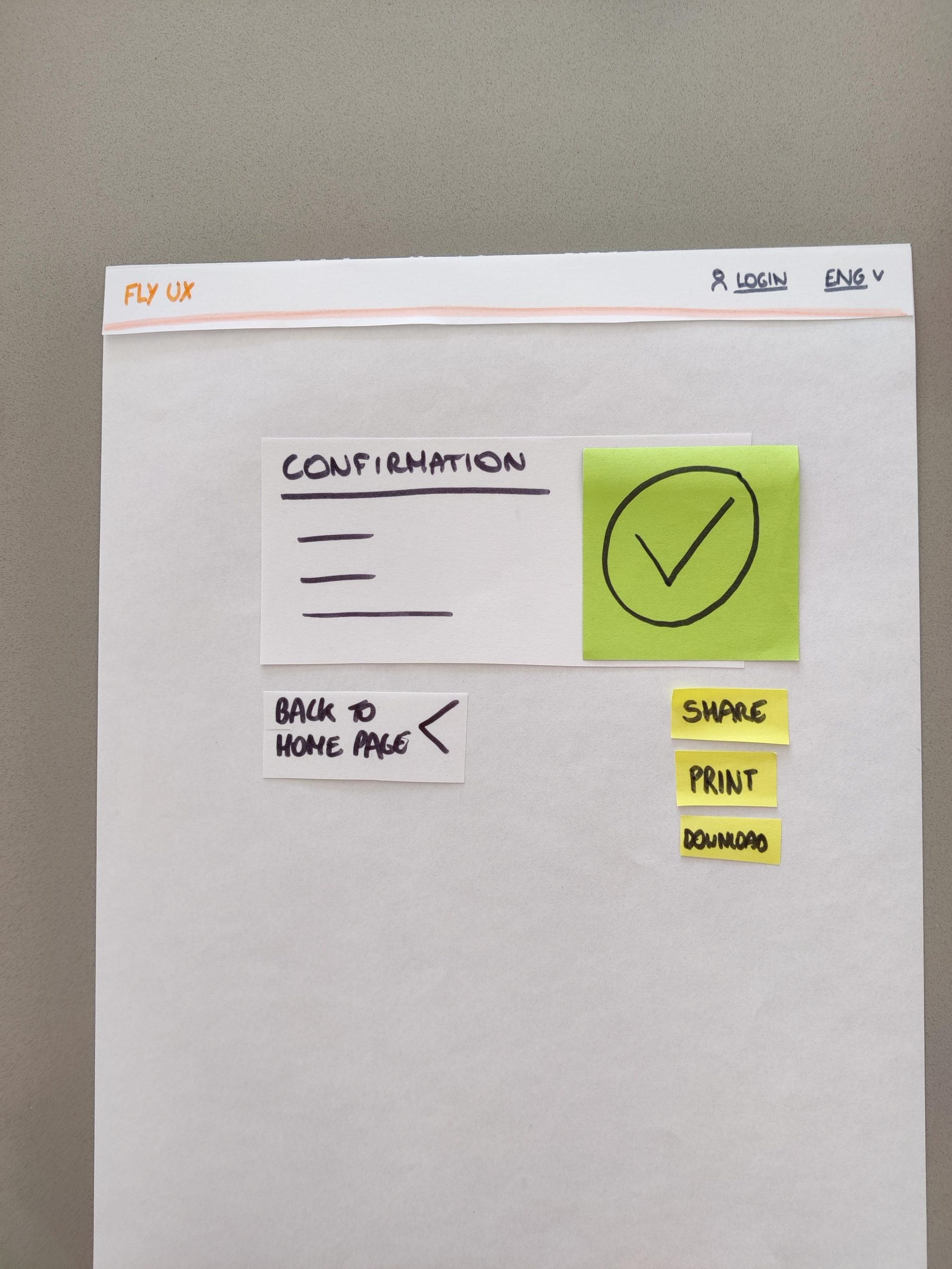
In a first phase, I created some rough paper sketches, which I kept improving and improving – with the help of my arts & crafts toolbox – until I had my first low-fidelity wireframes.
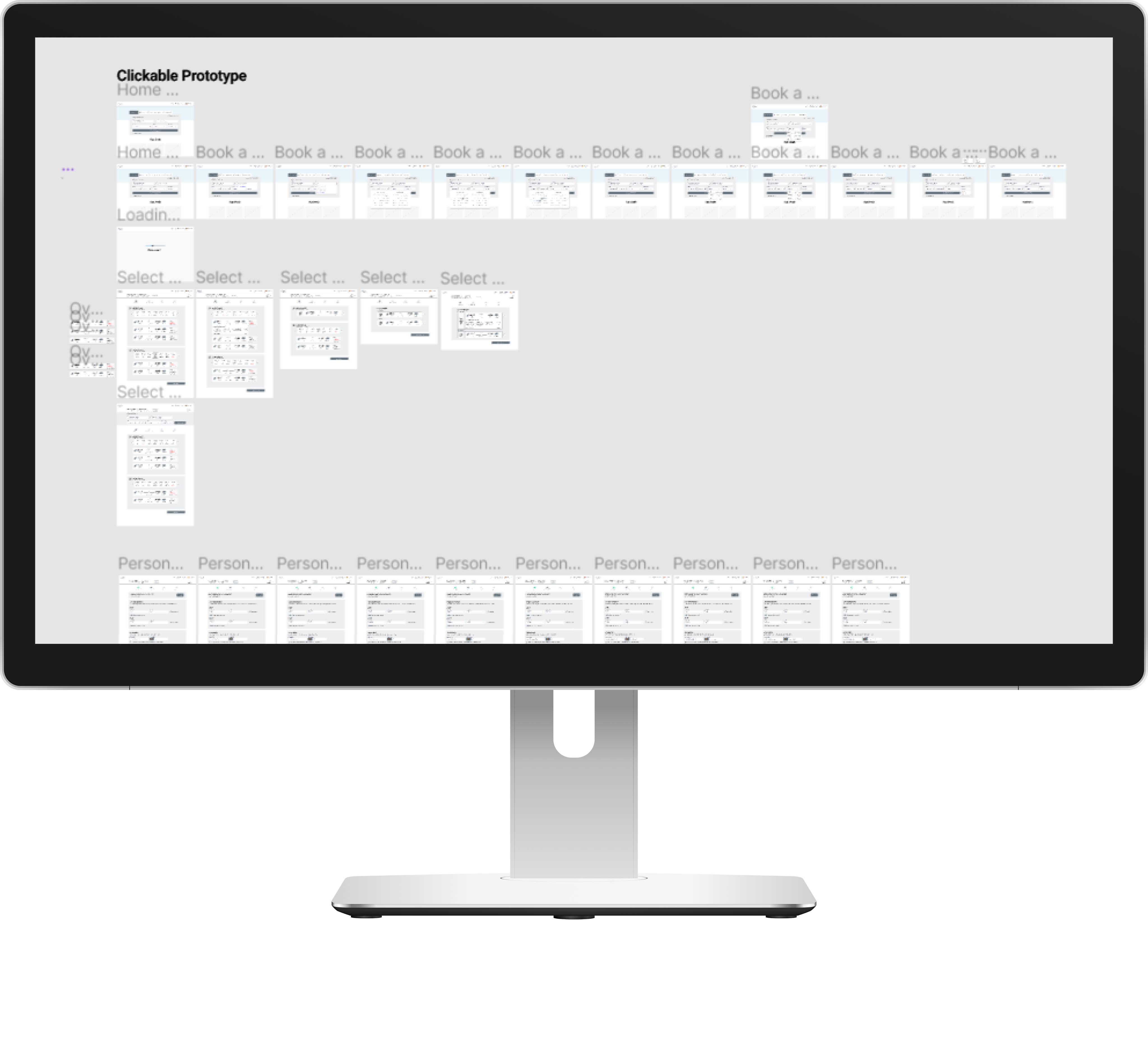
Clickable prototype
In a second phase, I used Figma as the final design tool. I had already defined a lot of the solution, but it was now time to add in all the details and interactivity.
While using all my previous references, I build a medium fidelity prototype following the guidelines shown in the lessons of the UX Design course.
After many iterative steps, improvements and testing, I finally delivered a full clickable prototype that I’m proud to present.
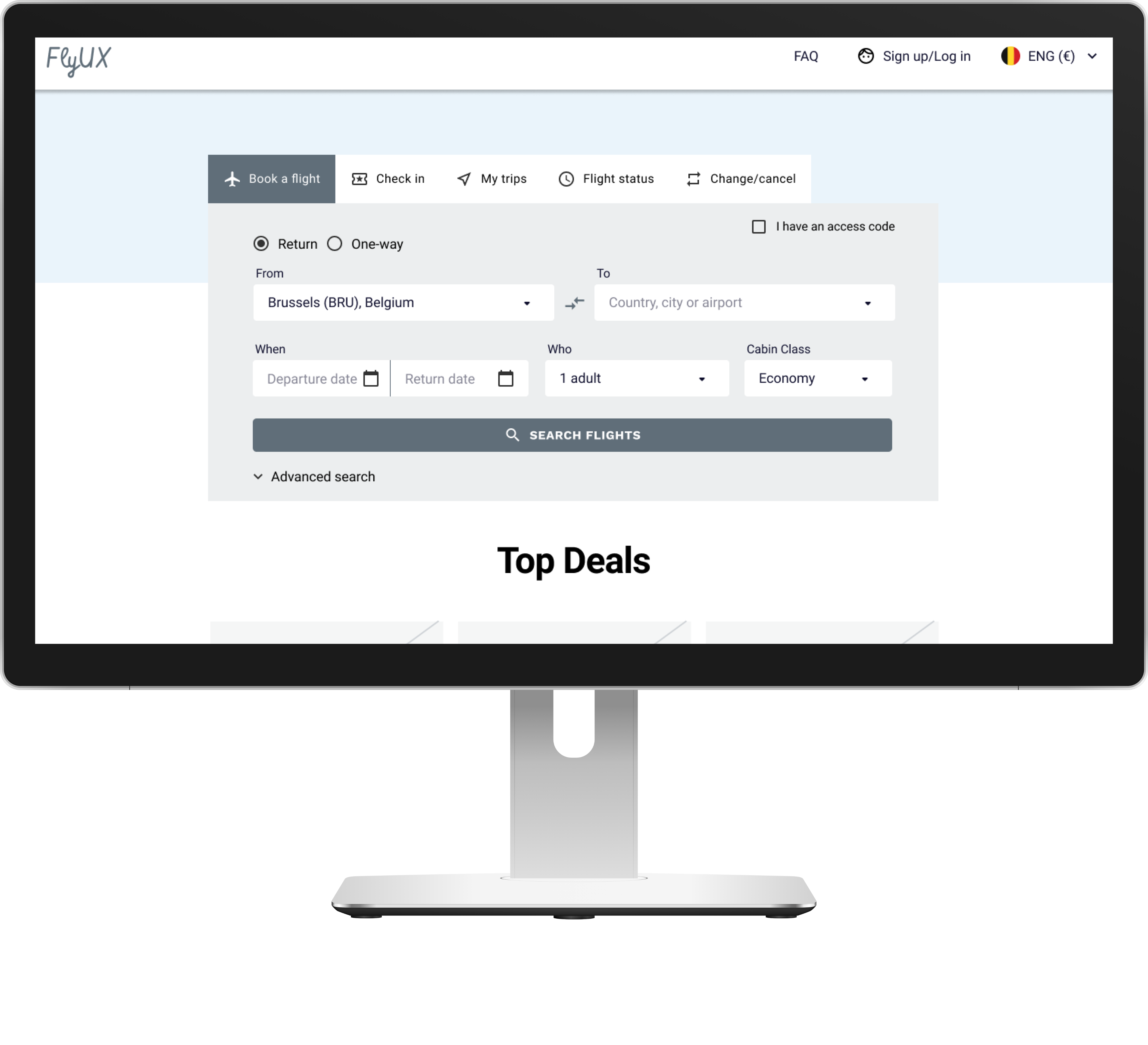
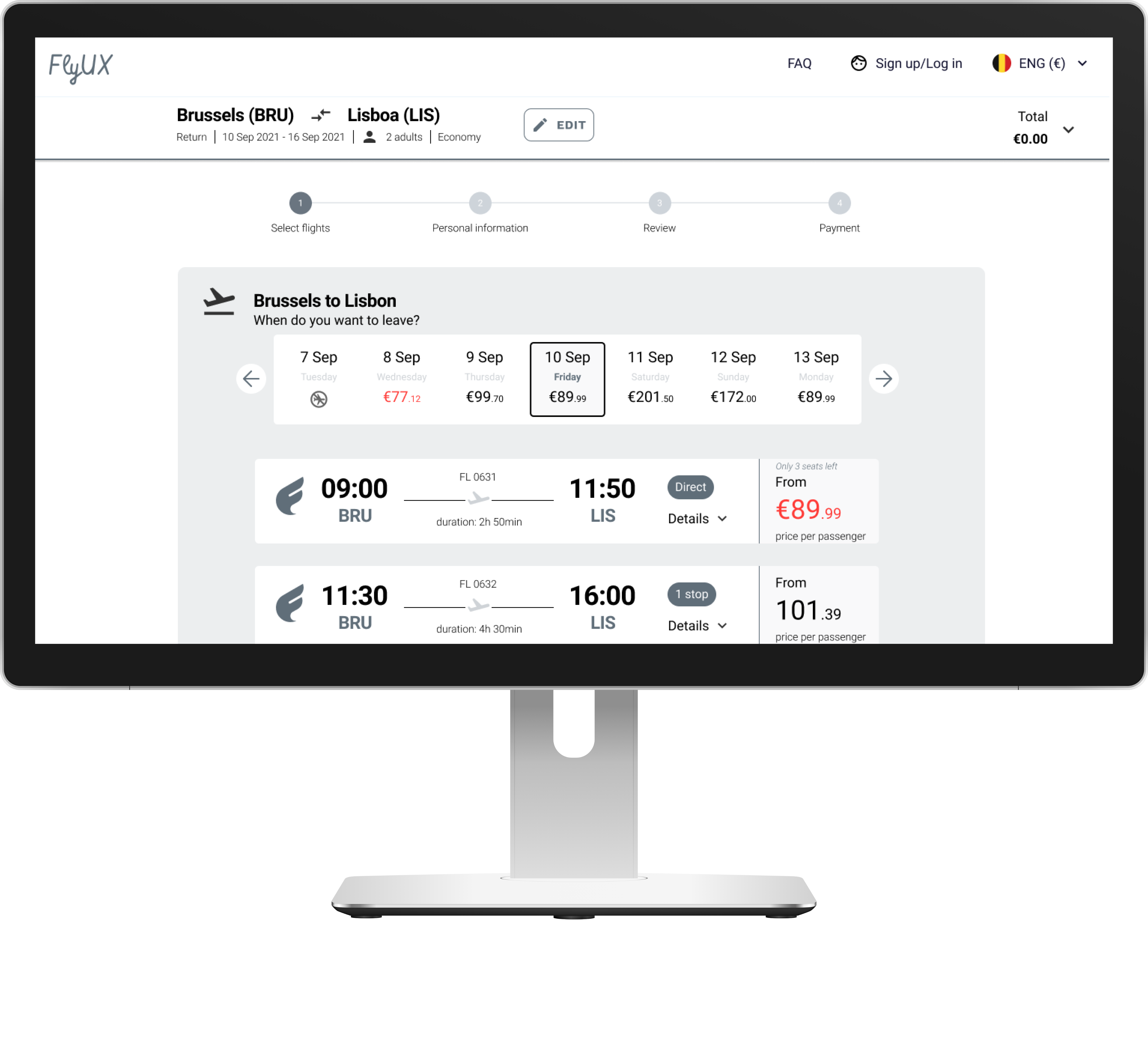
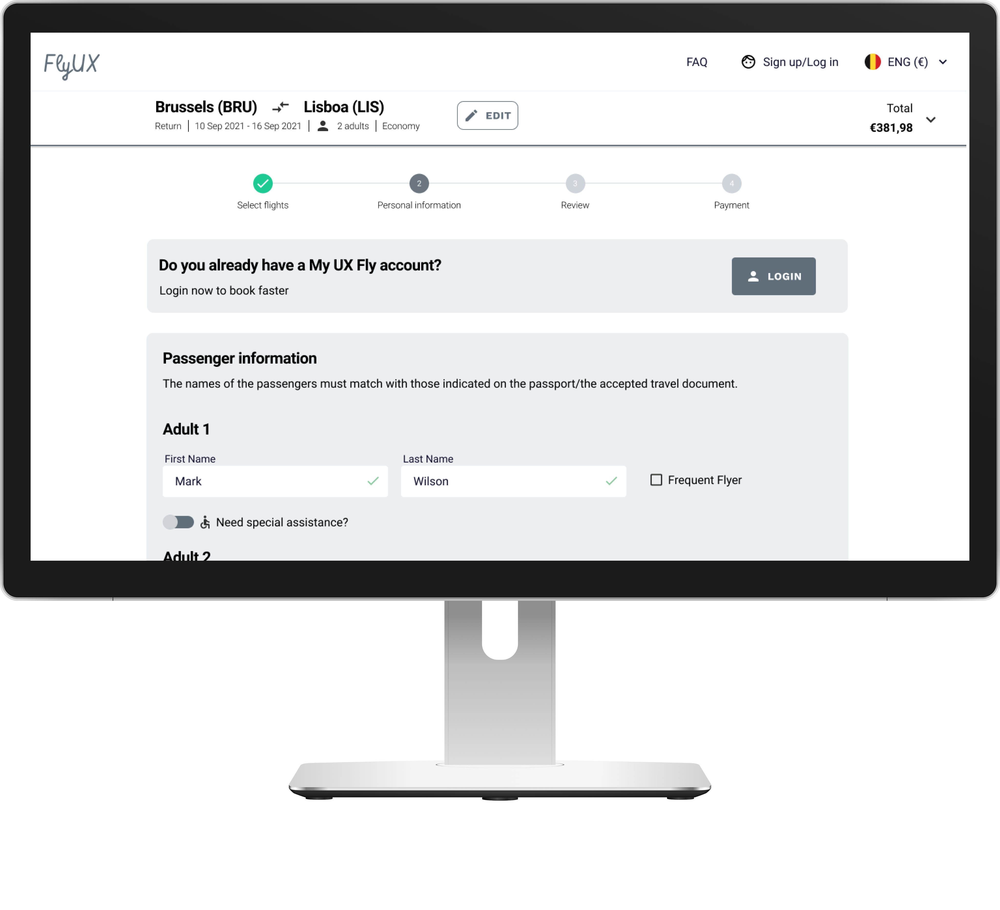
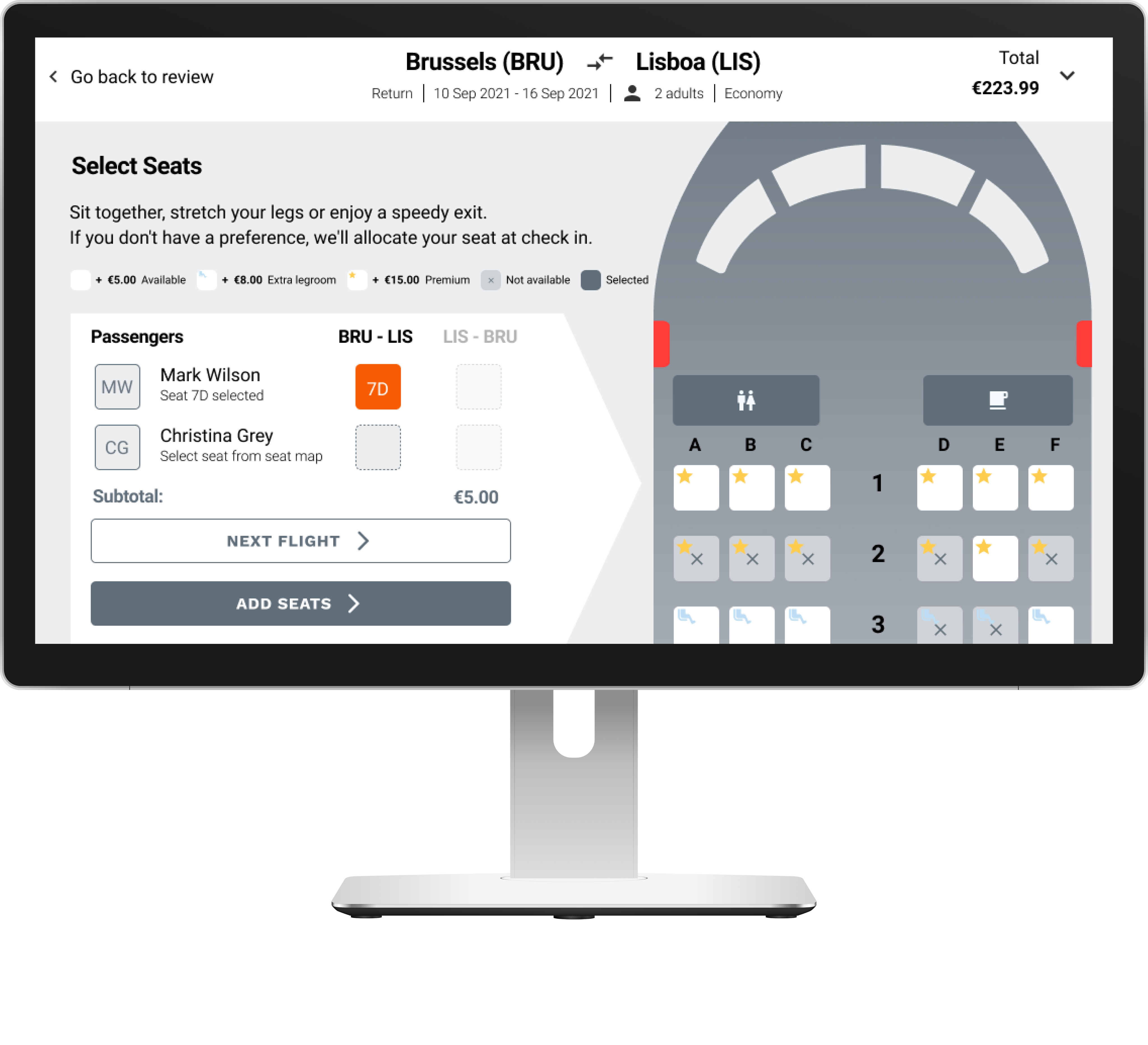
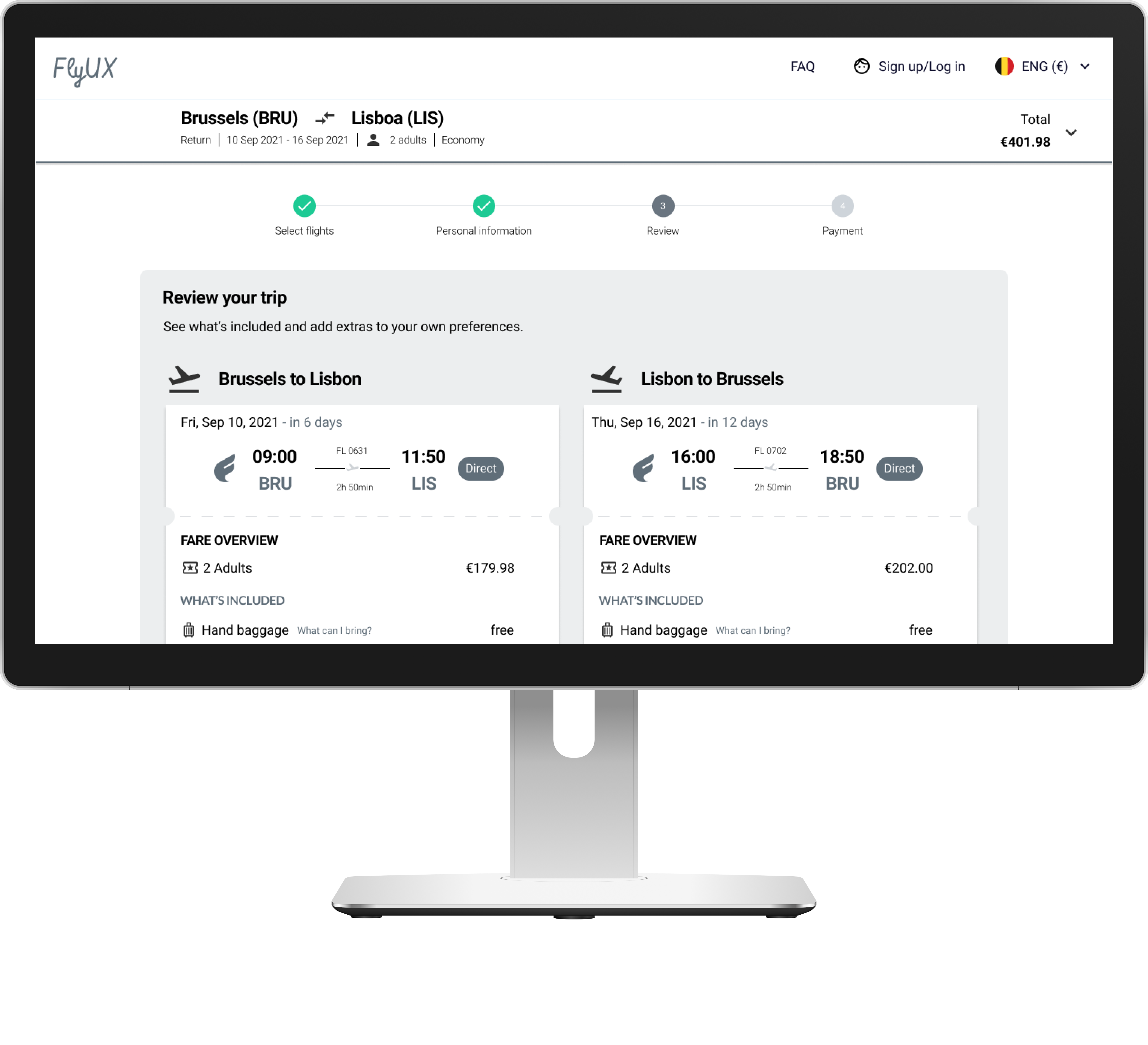
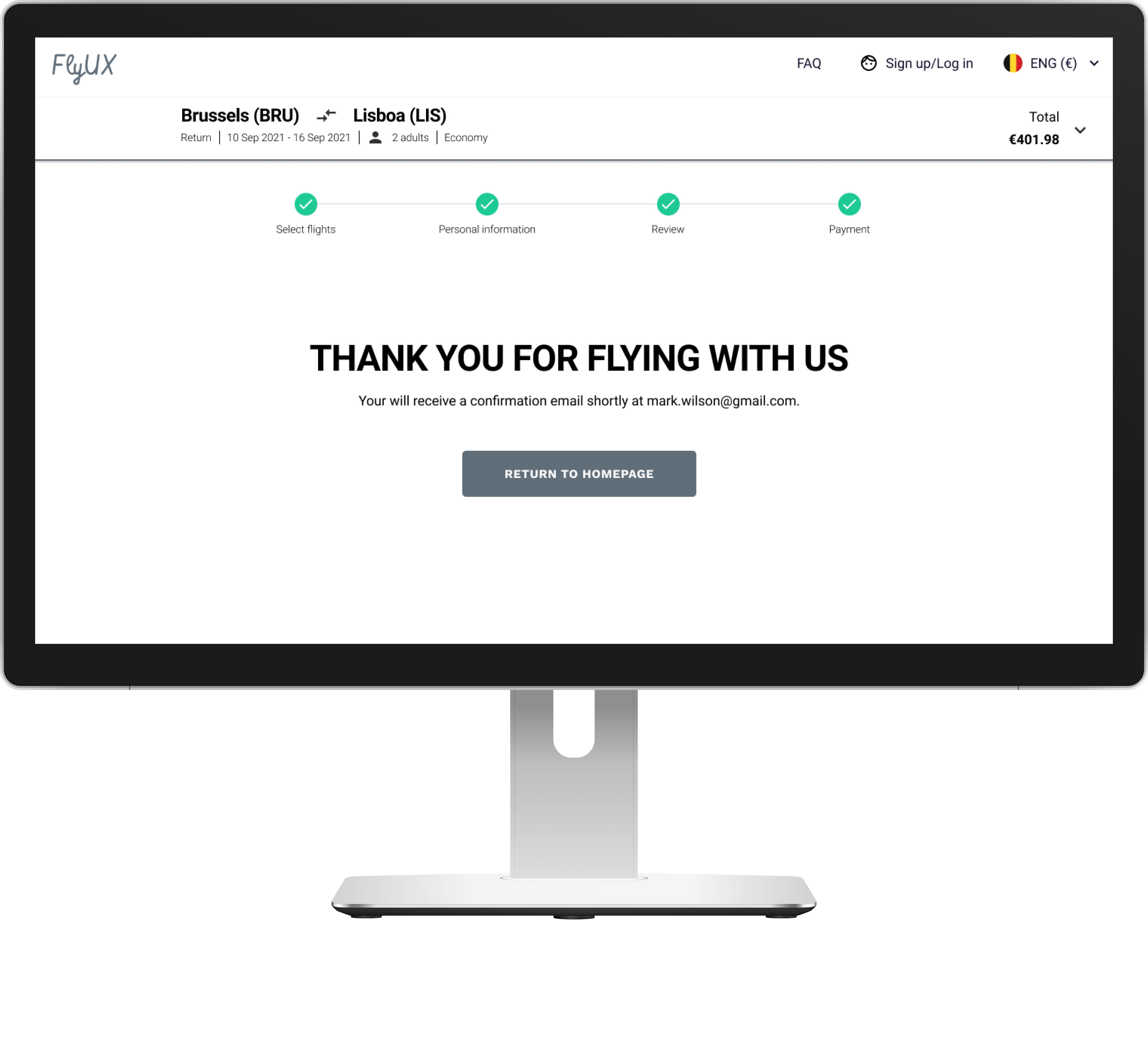
If you like to test out the prototype, please assume the following scenario:
Your name is Mark Wilson
You live in Belgium, Brussels
You want to do a city trip with your wife (Christina Grey) to Lisbon
As this was a fictive project to obtain my UX Diploma, a real implementation of the application was never in scope. However, the final exercise included the creation of annotated wireframes as if we were to showcase our designs to a team of developers. By creating those annotations, I got to think about all the different states of interactivity of the screens and elements used in my design.
Writing the annotations really helped me to discover potential deviations of the happy flow and made me think of different solutions to cope with these exceptions.
Example of annotated wireframe
Reflection
This project was challenging although very rewarding. It gave me a very hands-on experience of a UX design use case in which I acquired extensive knowledge related to all steps of the design process. Not only did I discover the importance of research, but I also discovered new technical skills while designing and thereby using different design tools.

![[Final2] Affinity Diagram - Post-its board (digitalized)](https://lindedecuyper.com/wp-content/uploads/elementor/thumbs/Final2-Affinity-Diagram-Post-its-board-digitalized-1-q3tespd4i71jxtxvrr6sfi5dhet0jbx1w3n160h6ug.png "[Final2] Affinity Diagram – Post-its board (digitalized)")